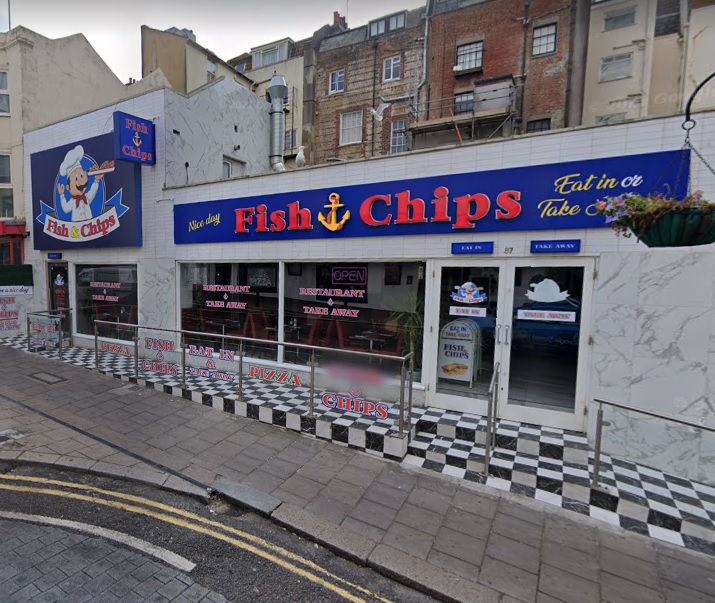
A Brighton chippy is fighting to keep a tiled outside area and signage, which the council says is crude, but which it describes as jaunty.
Moussa Salama, who owns Fish and Chips in Preston Street, is appealing against Brighton and Hove City Council’s decision to refuse planning permission for the frontage, and an enforcement notice requiring him to remove an external ventilation flue.
As well as the chequerboard tiles, Mr Moussa put in a concrete ramp and seating area, handrails and glass balustrade in March 2020.
He only applied for permission in July 2021, and the enforcement notice was issued in 2022. He’s also been told to remove an external flue on the side of the building.
The appeal statement, written by Lewis & Co Planning, says: “One of the positive visual effects of the more brightly coloured and polished shop
front is to draw the eye away from the somewhat ramshackle rear facades behind the premises.
“So far from causing harm to the visual amenities of the host property, as opined by the council, the shop front alterations serve to enhance the immediate setting and the building, bringing the viewer’s attention away from the dilapidated backdrop to focus on the bright and eye-catching shop front.
“The seating area coupled with the glossy tiling to the front of the building present a jaunty seaside aesthetic appropriate to its location a stone’s throw from Brighton beach.
“With Preston Street being a popular, vibrant commercial thoroughfare, particularly busy during the evenings, the use of glossy finishes and an eyecatching design for the floor tiling is considered appropriate to the area’s established commercial character.”
When turning down the 2021 application, planning officer Emily Stanbridge said the outside seating area appears: “crude, poorly designed and at odds with the appearance of the front elevation and other seating areas on Preston Street which retain an open character.”
She also described the black and white tiles as “visually intrusive”.
Of the neighbours who have commented on the appeal, none seem to agree the frontage adds to the area.
One, whose details are redacted, said: “The ramp at the front entrance is not wheelchair compliant as there are further steps into the property and onto the terrace.
“The terrace is not in keeping with the temporary wooden ones at other restaurant premises in Preston Street and the glass and chrome materials at odds with the character of the area.”
Another described the frontage as “clearly awful”.


As with the ad hoc building outside restaurants on Church Road, there is an assumption by restaurants that Planning does not apply to them. As for Lewis’s assertion that the rear of Regency Square is manky, this applies to the rear of many grandly-fronted buildings and if that were reason for such gaudy building as this Preston Street one beside them , Brighton would be even more of a by-word for anarchy. How refreshing it is to look up at the first-floor designs and decorations on Western Road after being assaulted by the corporate facades at ground level.
Worst possible taste facade at this chippy. The ugliest chippy I have ever seen and completely out of character for Preston Street, downtown Brighton and Hove. No prior planning application I believe tge owner are changing they’ll get away with it thinking the zvouncil can’t be bothered to apply the rules. This happens so much with cafes abd fast food outlet in particular.
Looks great. Leave them alone and go and deal with the real issues.
Maybe the council could look after there housing instead of just pestering people who pay business rates.
The council should get compromises with the business owners to help and support their business in difficult time.
Aesthetical tastes aside, this work was done without planning permission. I don’t think it needs any other considerations.
Typical Government overreach
Maybe the council can spend its time more effectively in Brighton. Such as dealing with the drug and homelessness issue, restoring crumbling infrastructures like the roads which are full of potholes or making public transport more convenient with more bus services. Brighton and Hove is run by the greens yet we don’t have a recycle bin. Work that one out.
It looks smart and inviting. What’s the problem? Many parts of Brighton are dirty, uninviting and look like a sh*thole to be frank. They should be investing in this kind of decoration, not poo-pooing it!
I think all the graffiti, smackheads sat on pavements, sleeping bags outside shops and tents pitched up everywhere is crude, but going after a business is an easier target for this inept council.
The shop always has customers, and is open, unlike some shops down the street, their food is good, leave them alone,
Seeing as the ‘food’ they serve has no association with good health, it’s hardly surprising the owner disassociated himself from regulations, too. He’s selling a product that heavily contributes to heart disease and obesity, meanwhile, ignoring laws. On top, his shop has the image of a place you’re more likely to find in a theme park.
Oh leave the man alone. I do admire a chequered tiled floor, it’s a classy addition. I mean look at that hall Francesca Annis played that Duchess in on telly some years ago. Somewhere up in Norfolk I think. Wall to wall black & white tiles. From the Regency Period. Gorgeous! That council are a bunch of philistines.
The place is lit like a mix between a dentist and a Russian gulag. The fish and chips are bottom of the barrel. Anyone who thinks this looks good or classy needs to wind their neck in, stay indoors with their big light energy and smother themselves with their Union Jack pillows. Leave discussions on taste to the adults.