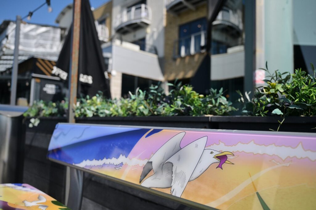
A University of Brighton student has seen her designs come to life having won an annual competition to design the public benches at Brighton Marina.
Tiana Szalajda-Smith’s winning design, which showcases the flora and fauna of Brighton, was unveiled today on 27 benches across the marina, including at the iconic waterfront.
The third year student’s design won the most votes from the public, who voted between three shortlisted designs on the theme of ‘Sussex Nature and Wildlife’.
Szalajda-Smith, 21, commented: “I applied to this competition without grasping the thought that I might actually win.
“It felt like my work was being recognised by a wider audience for the first time and I feel a huge sense of accomplishment.
“The fact that my design work is leaving my bedroom for once and going out into the real world where regular people walk by every day is very exciting.
“It feels like a great stepping stone into my career as I leave university, as well as a big confidence booster.”
The initiative, which launched last year, will see the designs remain on the benches until the start of next year’s competition.
Students from the School of Art and Media at the University of Brighton were invited to submit designs, which were judged by a panel of artists and lecturers in April.
More than 1,300 votes were cast across Brighton Marina’s channels, with Szalajda-Smith’s design receiving 625.

Szalajda-Smith, who is studying Design for Digital Media, said: “My design was definitely very seagull-heavy, because whether you like them or hate them, they are a huge part of Sussex life.
“I thought it was only right to embrace this, along with other animals like the foxes, bumblebees, pigeons, crabs and a little sausage dog on the boardwalk.
“I wanted to also show off some of the beautiful flowers of Sussex, taking inspiration from flowers I saw in Brighton Pavillion – lilies, peonies, foxgloves and symphytums- as well as, of course, the coast.
“I included the starling murmurations too as this is something I was taken aback by when I first moved down South, having never seen them before.”
Sophie Chandler, marketing manager at Brighton Marina, said: “It’s been so heartening to see the breadth of designs that were created for the competition, so we want to say a big thanks to all the entrants for all their hard work, and congratulations again to Tiana.
“Her design captured the Sussex wildlife beautifully while also reflecting elements of the city.”
Vanessa Marr, lecturer and course leader, said: “As Tianna’s Course Leader and third year tutor I am extremely proud of her success in this competition.
“She is a talented illustrator, and as such this competition was a great opportunity to develop her skills through a professional design brief, whilst showcasing her work to the public.
“Tianna’s winning design captured the diversity of our coastal wildlife, along with the ubiquitous seagull, through a colourful composition that is dynamic and surely appealing to all who visit the area.”
The costs for production and installation of the bench design were covered by Landsec, the landlord of Brighton Marina.


I am very pleased for her, but her designs lack any assistance for people who have disability or are elderly. We all like to get out but when we have seats we need an arm or something to pull ourselves off the bench. Maybe the next project should be designing public benches for disabled people.
I’m not certain, but I think the designs are purely illustrative?
Yes: the competition was for the printed vinyl to go on the benches, not the design of the benches themselves.
Good point re lack of support for people with mobility difficulties . Also REALLY! Is this the best design? Would have been more creative to let street graditti arrists lose on each individual bench.
Well, they should have participated in the annual competition to design the public benches at Brighton Marina then, shouldn’t they?
I’m sure the art in this case isn’t simply about the initial visual appearance, but a reflection of the perception of the marina environment and what people relate to.
If it represents a memory that a visitor to Brighton may treasure, it pretty much sums up that visualisation of Brighton seafront, like a happy memory being a shared little bullet of joy.
Not just the seagull, but the line of a breaking wave, and cleverly the colours used as a nod to an inclusive community inherent within that bullet of joy, in a very subtle and subliminal manner. The style too is very ‘Brighton Graffiti” as a further nod to who we are and who we like to be. All the good stuff.
Well judged, uplifting, and very clever.
p.s. You also note the endless rising of the image from left to right, so giving the feeling of an assent, lifting the spirit. All subliminal cleverness.
I appreciate the commentary from a much more discerning artistic eye, then I.
Heat on paint…hope no colour transfers to clothes on heat wave days of searing sunlight..
They’re vinyl wraps. They might fade but if it’s hot enough to melt and transfer your average bench user has bigger problems (like being on fire).
Congratulations I love those benches..
From South Coast Gull volunteer rescues; we love your designs and hope that it does sway more of the general public into respecting the now critically endangered herring gulls now are [ICUN redlist) How exciting for you personally to have your amazing skill set ratified. You have a great career ahead of you Tatania.